
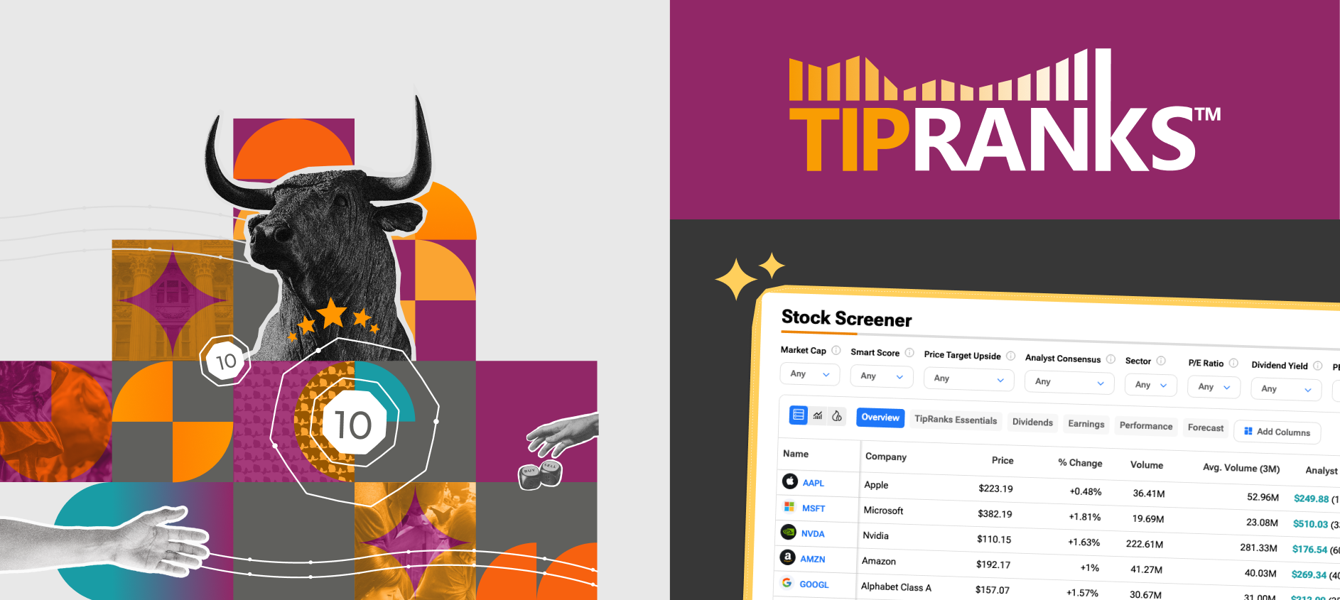
Turning an existing logo into a scalable visual language.
My Role: Design Team Lead · Brand Strategy · Creative Direction
Created in collaboration with Inbal Bruker, Graphic Designer
TipRanks helps retail investors make better, data-driven decisions by making professional financial research accessible, transparent and easy to understand.
As the company expanded across products, platforms and markets, its visual presence needed to evolve with it. The goal was to transform a recognizable logo into a complete brand system—one capable of supporting everything from complex investment tools to global campaigns.
Starting with what already existed
As Design Team Lead at TipRanks, I led the development of the company’s visual brand system in close collaboration with Inbal Bruker, a graphic designer on my team.
I did not design the original TipRanks logo. Our work began with the existing logo and focused on translating its visual principles into a complete, scalable brand language—one that could support the company’s product, marketing, content and communication needs.
Together, we defined the system’s colors, backgrounds, photography, graphic elements, voice and practical applications, creating a shared foundation that could be used consistently across the organization.

Instead of replacing it, we treated the logo as the foundation of the new visual language.
We studied its shapes, colors and underlying ideas, then expanded them into a flexible system that could express the broader TipRanks experience across product, marketing and communication.
The challenge
TipRanks operates at the intersection of finance, data and technology.
The platform gives everyday investors access to information that was once available mainly to financial institutions. This creates a complex design challenge: presenting large amounts of professional data without making the experience feel overwhelming or inaccessible.
At the same time, the brand needed to communicate trust. Financial decisions are personal, and users need to feel that the information they see is accurate, transparent and reliable.
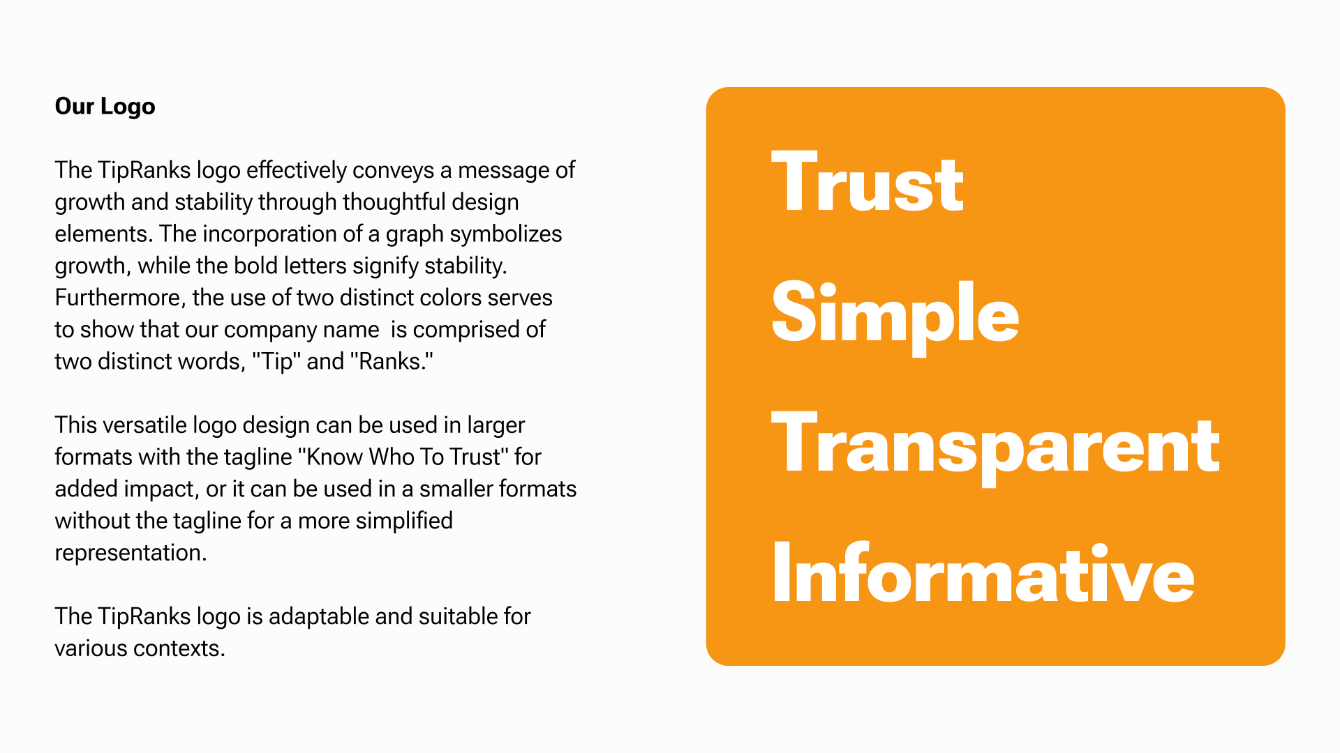
The identity therefore had to balance four qualities:
Trust. Simplicity. Transparency. Information.
From logo to visual system
The existing logo gave us the first building blocks of the identity.
Its orange became the brand’s primary signal—a color associated with action, energy and visibility. We paired it with solid gray and open white spaces to create a clear, grounded foundation.
Additional colors were introduced with a functional purpose. Bullish Blue and Bearish Purple connected the system to familiar market language, while supporting gradients added depth and flexibility for campaigns and social communication.
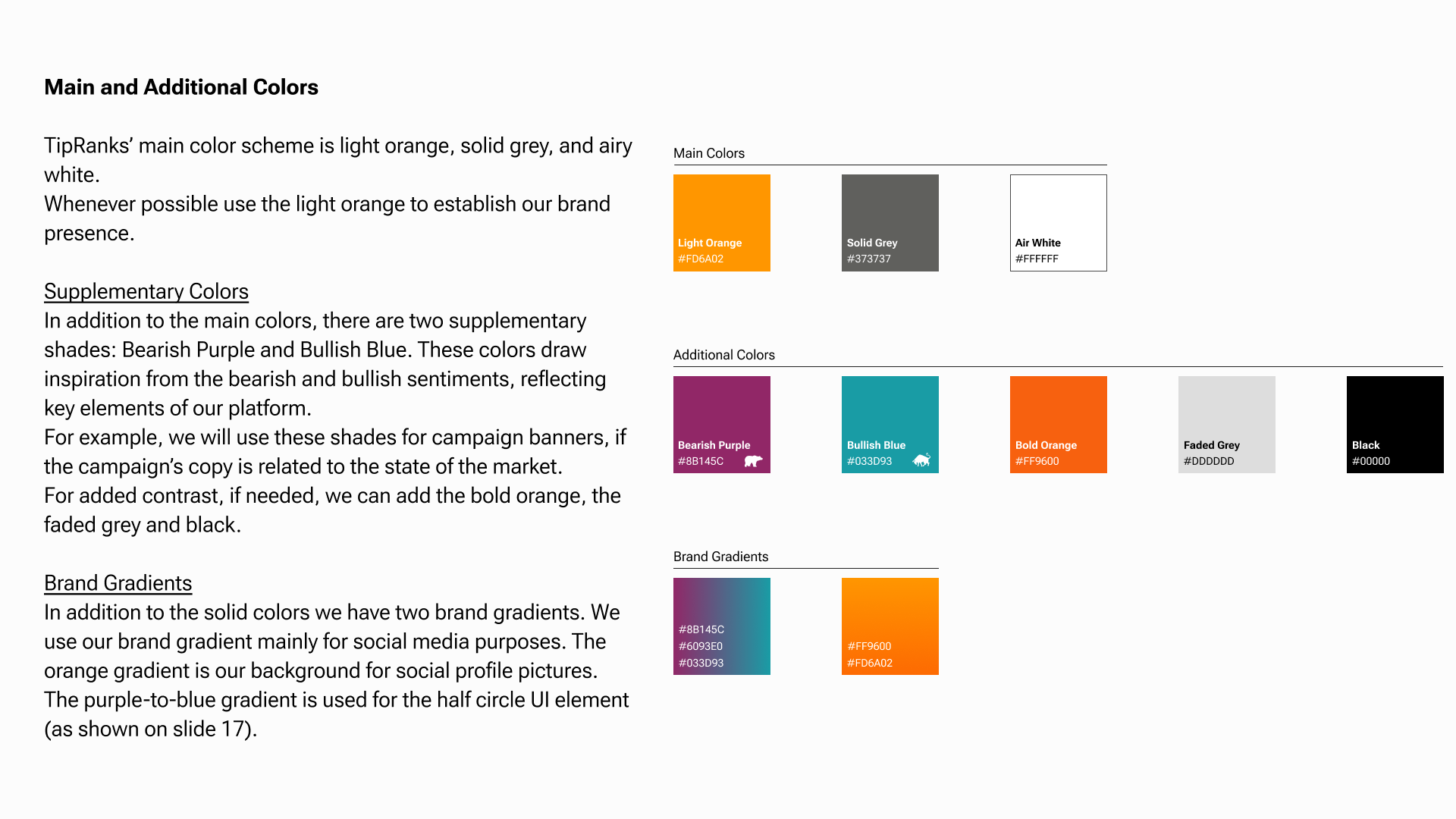
Rather than treating color as decoration, we built a hierarchy that helped users understand both the brand and the information it presents.
Creating recognizable environments
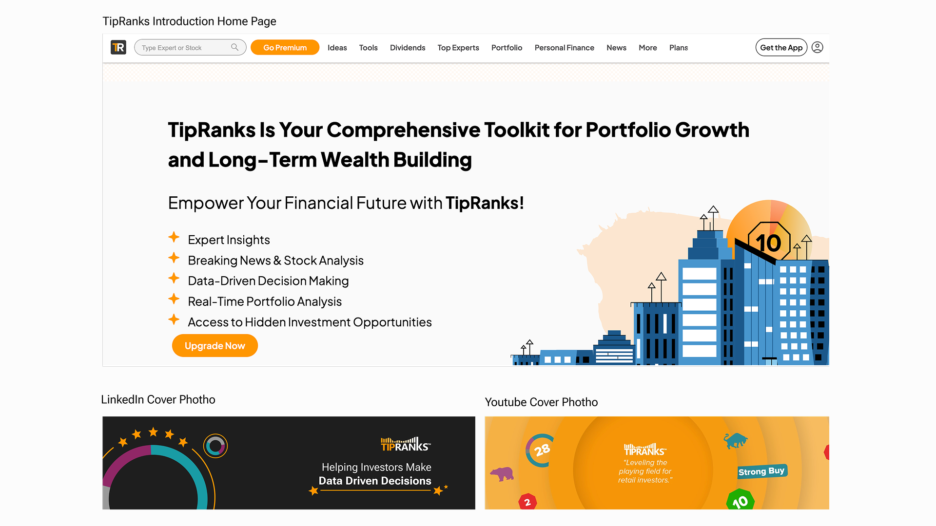
To make the brand identifiable even when the logo was not the main visual element, we developed a set of distinctive branded backgrounds.
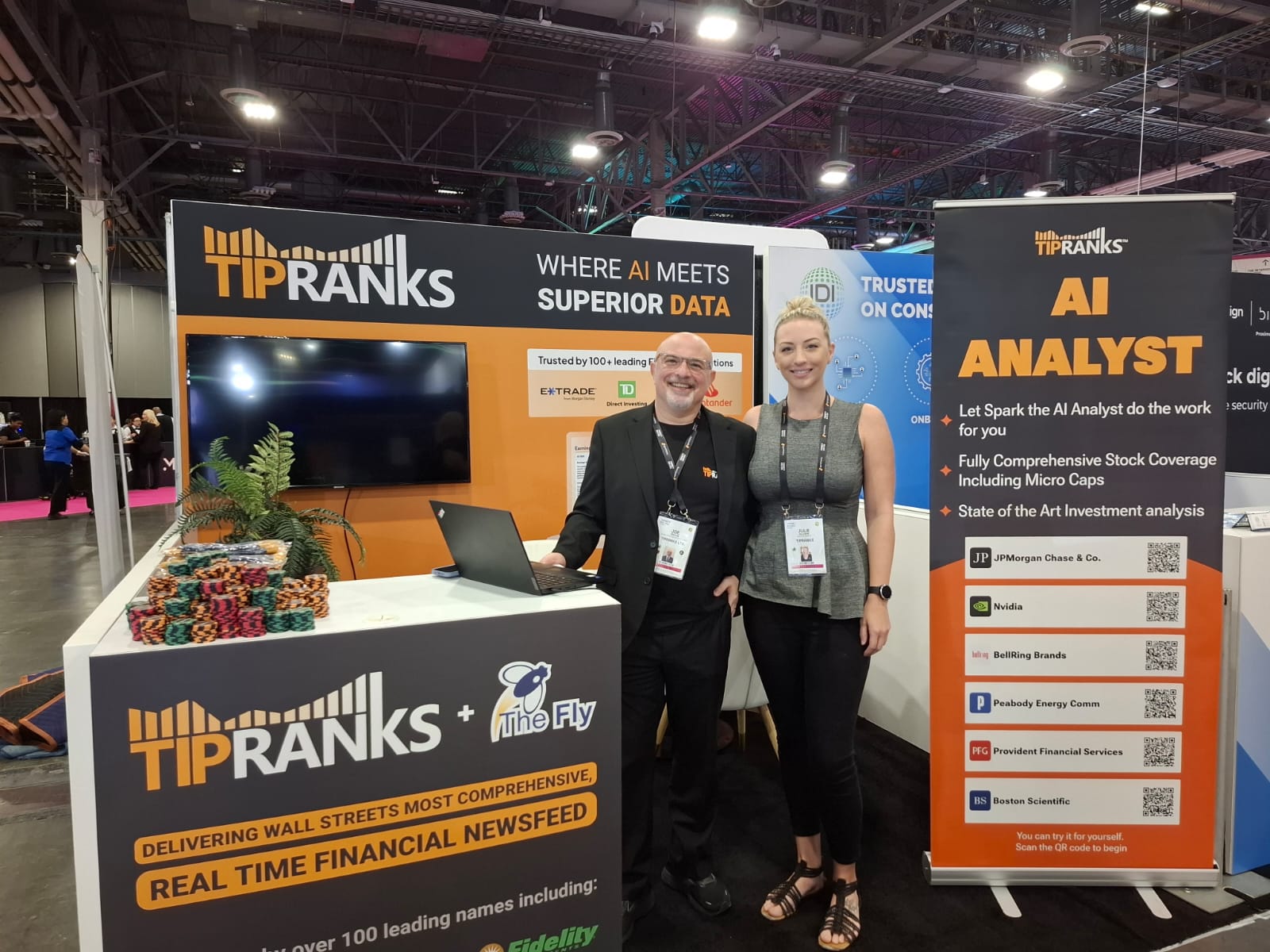
A dark blue environment became closely associated with the TipRanks mobile app and its campaigns. Orange was used for bold, high-visibility moments such as exhibitions and large-scale brand communication. A dark data-dot background created contrast for advertisements, product messages and calls to action.
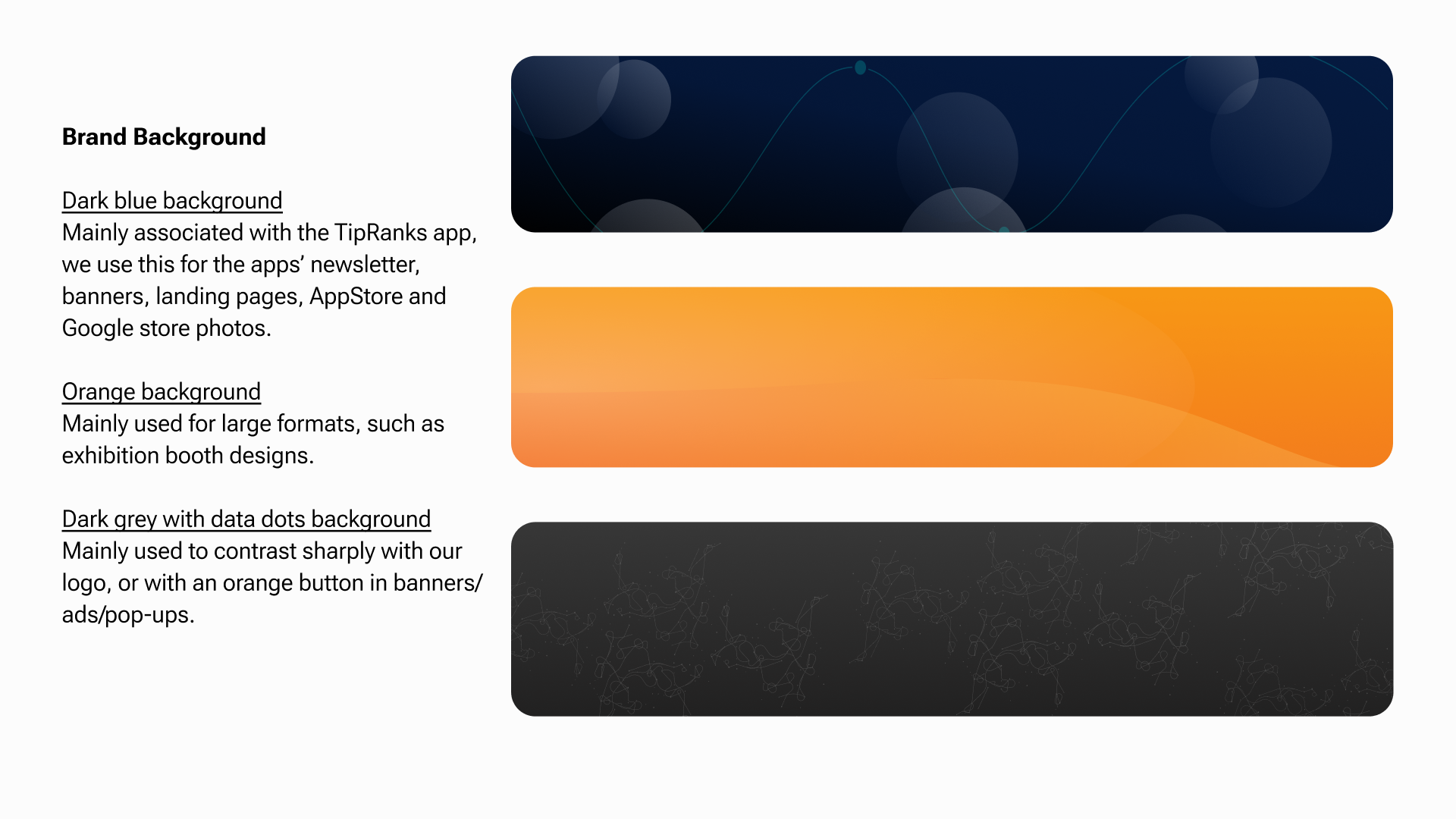
These environments allowed different teams to create varied content while maintaining a consistent TipRanks presence.
Making financial data visual
The product itself became an important source of inspiration.
Stars, score indicators, charts and custom UI elements were already central to the TipRanks experience. We brought these elements into the wider identity, turning functional product patterns into recognizable brand assets.
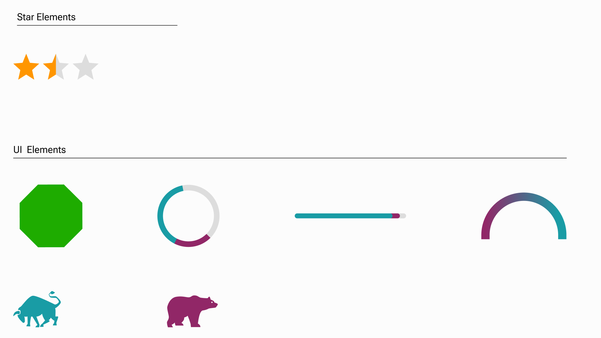
Stars represent the rating and performance of financial experts, making them a natural symbol of trust. The Smart Score hexagon and sentiment indicators communicate complex data in a compact, approachable form.
By using these elements across campaigns, presentations, social media and company materials, we created a direct connection between the brand promise and the product experience.
Simplifying the product story
A financial research platform contains far more information than can be communicated in a single campaign.
For marketing applications, we created simplified versions of product components that preserved the meaning of the interface while removing unnecessary detail. Charts were reduced to their essential forms, tables became lighter, and key data points were isolated and emphasized.
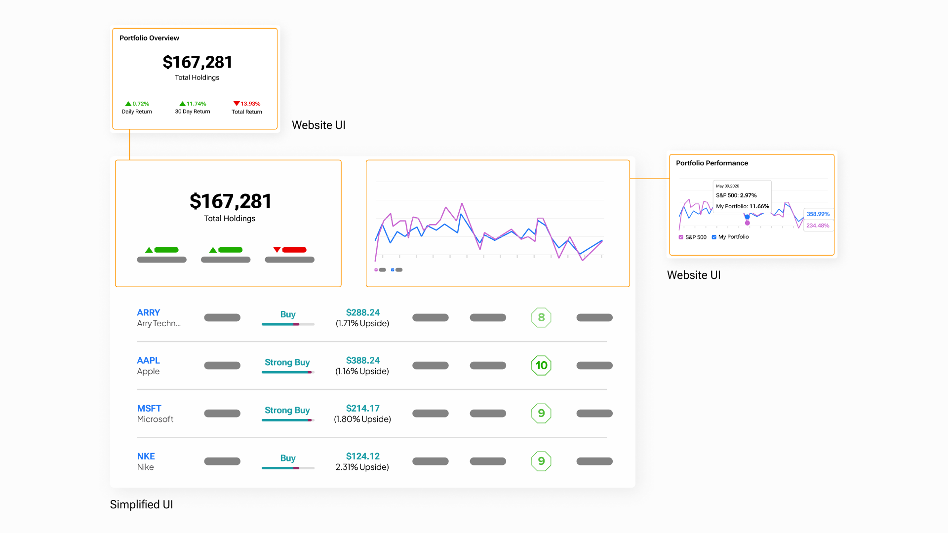
This made it possible to explain complex tools quickly without creating a visual language disconnected from the actual product.
The product was no longer something shown inside the brand. It became part of the brand itself.
A more human view of finance
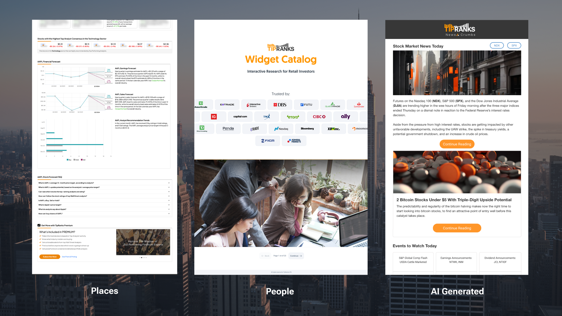
Photography helped balance the analytical nature of the platform.
We defined three main categories: places, people and AI-generated imagery. Places created atmosphere and context. People introduced authenticity, diversity and an emotional connection to the investors behind the data.
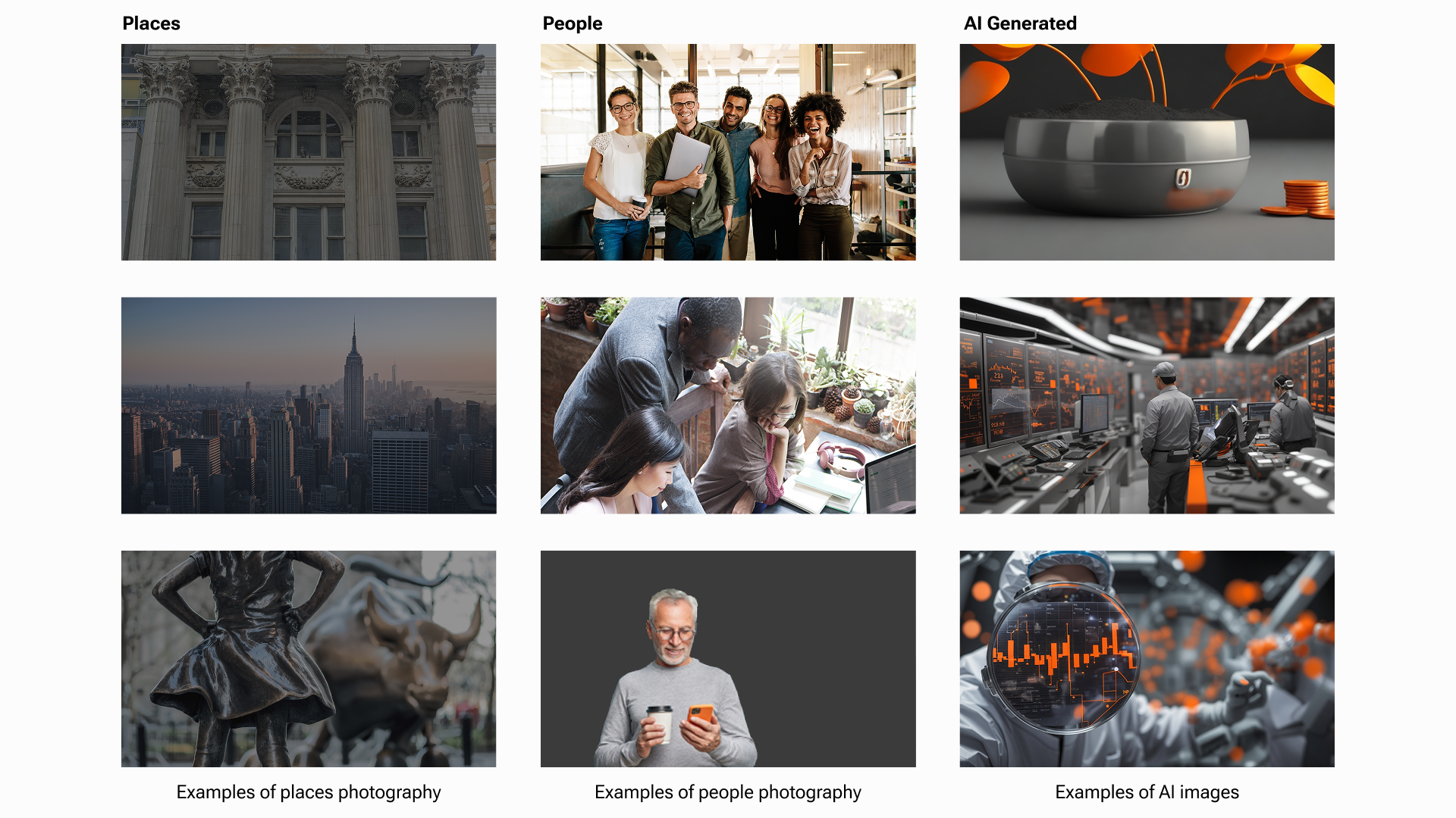
AI-generated imagery gave us an additional way to create distinctive editorial content. Using parameters such as orange, gray, sleek and high-tech, we developed visuals that felt contemporary while remaining connected to the established identity.
Together, these categories allowed the brand to move between human stories, market environments and future-facing technology.
Finding the right voice
The visual system was supported by a clear and consistent verbal identity.
TipRanks speaks to everyday investors—not only financial professionals. The language needed to be direct, informative and easy to understand, without oversimplifying the subject or making unrealistic promises.
We avoided unnecessary industry jargon and focused on the value users receive:
Trust the Data.
Know Who to Trust.
Make Data-Driven Investment Decisions.
Leveling the Playing Field.
The tone is confident but responsible. It can be bold, concise and urgent, while always maintaining the trust and transparency expected from a financial brand.
Building one shared language
The brand guidelines brought all these decisions into a single practical system.
Logo usage, color, backgrounds, photography, voice, custom graphics and simplified UI were documented so that product, marketing, content and external partners could work from the same foundation.
The purpose was not to make every output look identical. It was to give each team enough flexibility to solve different problems while ensuring that everything still felt unmistakably TipRanks.
The outcome
What began with an existing logo became a complete visual and verbal ecosystem.
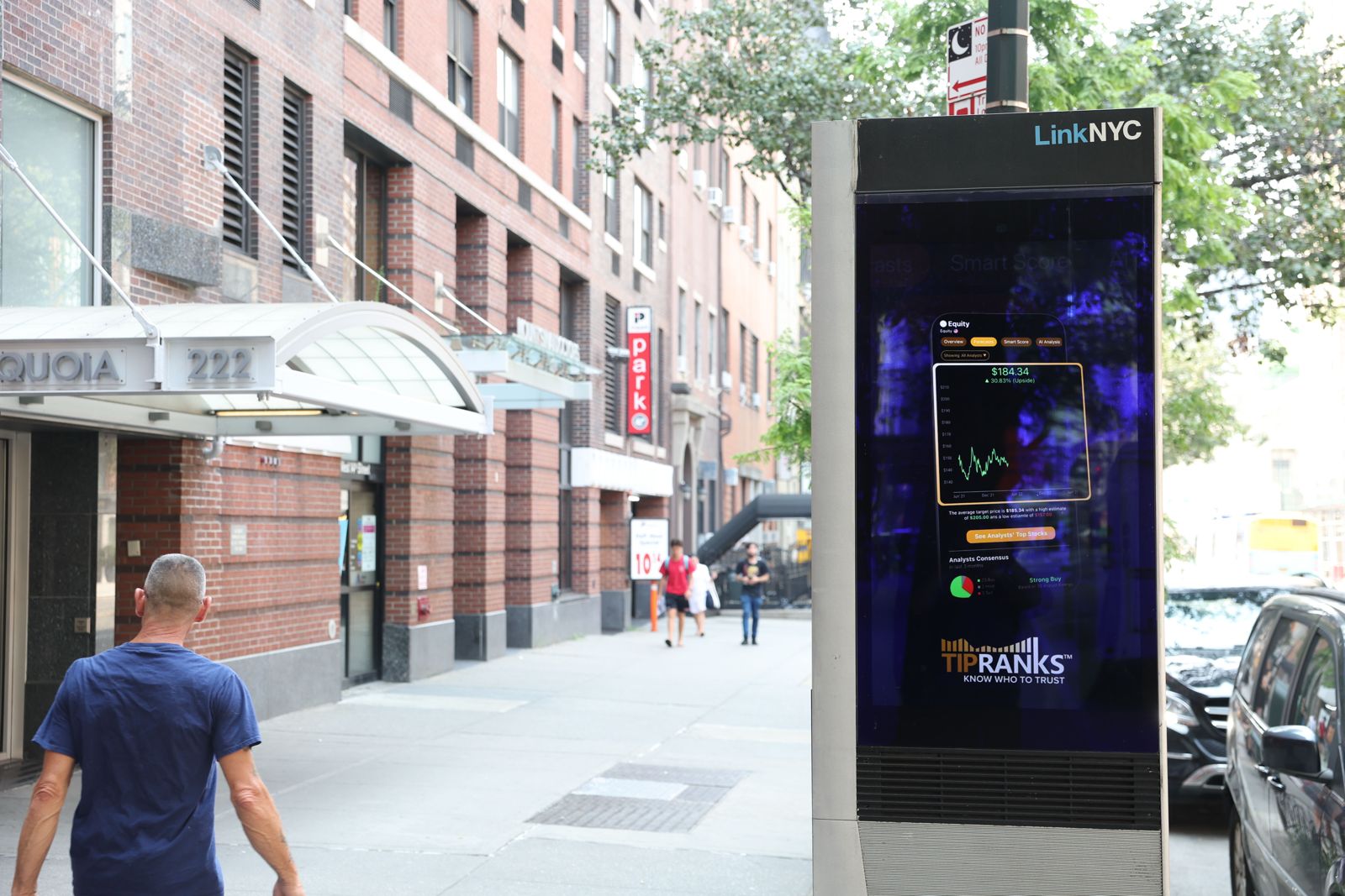
By extracting its core ideas—growth, stability, trust and data—we created a brand language that could scale across a complex product, mobile applications, editorial content, performance marketing, social media and physical environments.
The result is a system that makes financial information feel clearer, more accessible and more human—while supporting the TipRanks mission to level the playing field for retail investors.






Design Team Lead & Creative Direction — Aviram Rosenfald
Graphic Design — Inbal Bruker
