Brand Identity · Product Concept
Monstro is an iPad application that brings professional interface design workflows into a more natural, tactile environment. Built to work with Figma, it gives product designers the freedom to create, edit and explore interfaces while taking full advantage of the iPad, Apple Pencil and touch.
The goal was to build a brand that could make a powerful design tool feel approachable—without making it feel simplified.
The challenge
Professional designers expect precision, flexibility and complete control. Yet creative applications designed for tablets often feel like reduced versions of their desktop counterparts.
Monstro was created around a different idea: designing on an iPad should not require compromise. The experience needed to feel capable enough for serious product work, while remaining playful, direct and distinctly native to the device.
The identity had to express both sides of that promise: professional power and effortless creativity.
A friendly kind of power
The name “Monstro” suggested something bold, energetic and slightly unruly. Instead of presenting that power through a cold or overly technical visual language, I turned it into a character.
Monstro became a friendly little beast that lives inside the designer’s workspace. Curious, confident and always ready to make something, it represents a tool that is powerful without being intimidating.
The character also gave the brand a voice. Monstro does not speak like a traditional software company. It is playful, straightforward and confident—acknowledging the frustrations of designing on mobile devices and promising a better way forward.
Finding the character
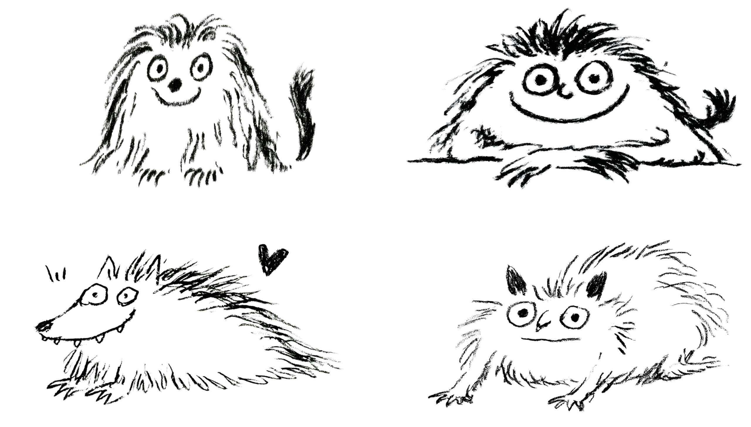
The process began with loose ink sketches rather than geometric logo construction.
I explored different creatures, expressions and silhouettes: tall monsters, wide monsters, strange noses, uneven fur and oversized eyes. The intention was not to draw a perfect mascot, but to discover a personality.
Each sketch tested a different balance between strange and familiar. Some characters felt too wild, while others were too soft or generic. The strongest direction emerged from combining the round, welcoming silhouette with the expressive eyes and mischievous smile found across the early drawings.
From sketch to symbol
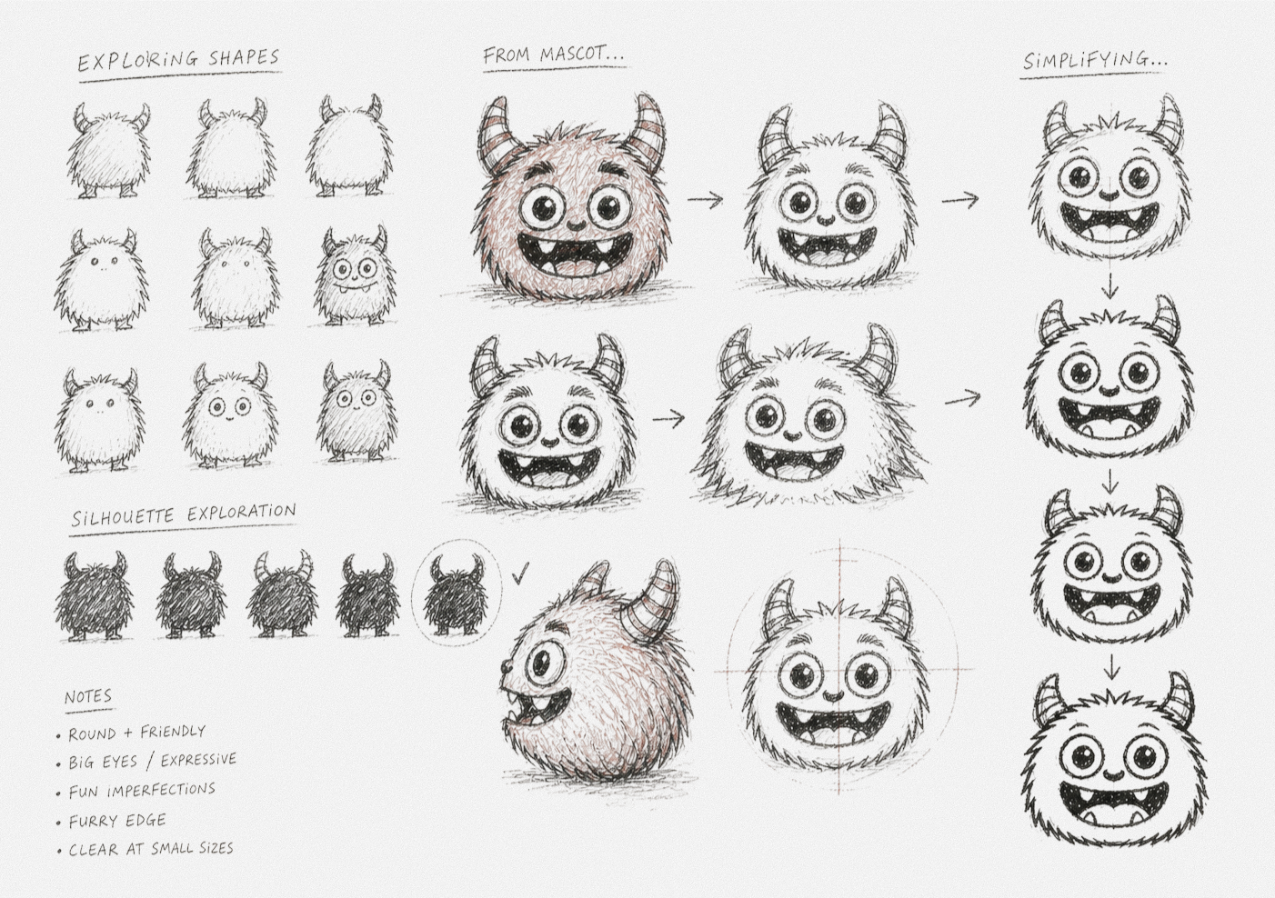
As the sketches evolved, the character became simpler and more recognizable.
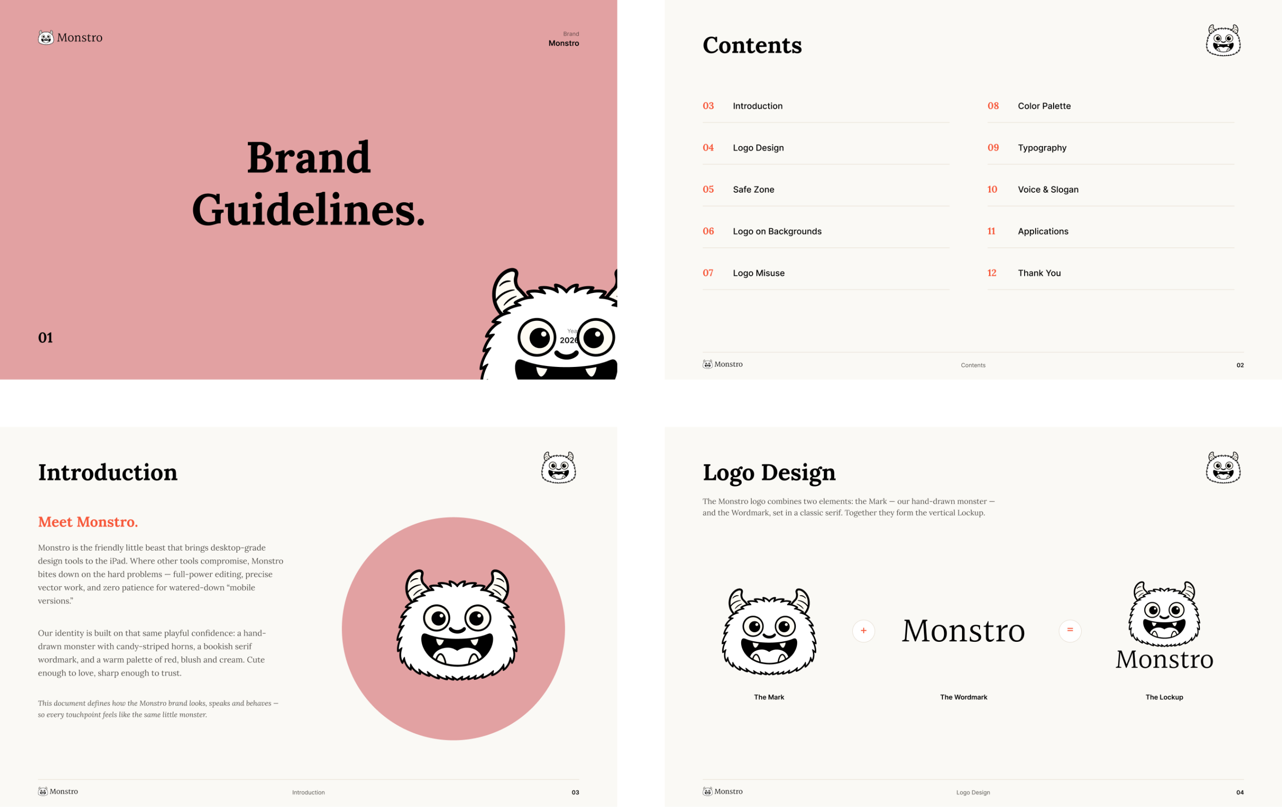
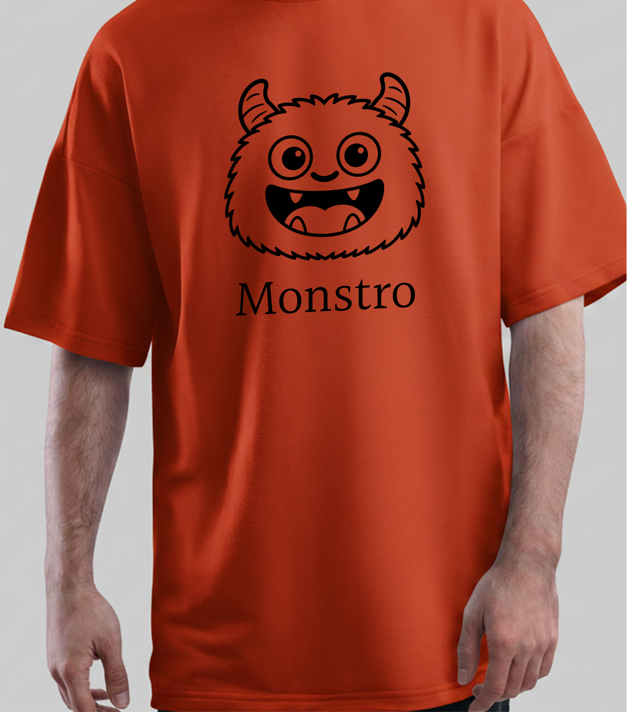
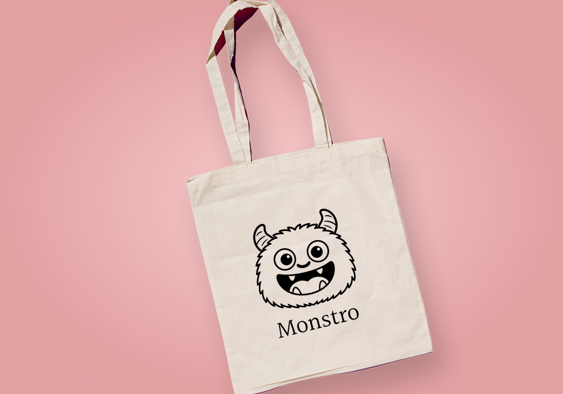
The final mark keeps the handmade energy of the original drawings while using a clear, controlled silhouette that remains legible at small sizes. The large eyes create focus and curiosity, the striped horns add a distinctive visual signature, and the open smile gives Monstro its optimistic, slightly mischievous personality.
The result is a character that feels equally at home as an app icon, a product companion or the centre of a campaign.
Building the identity
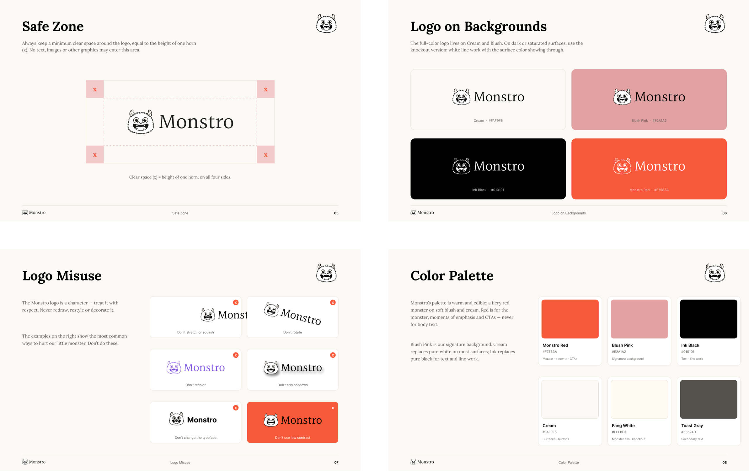
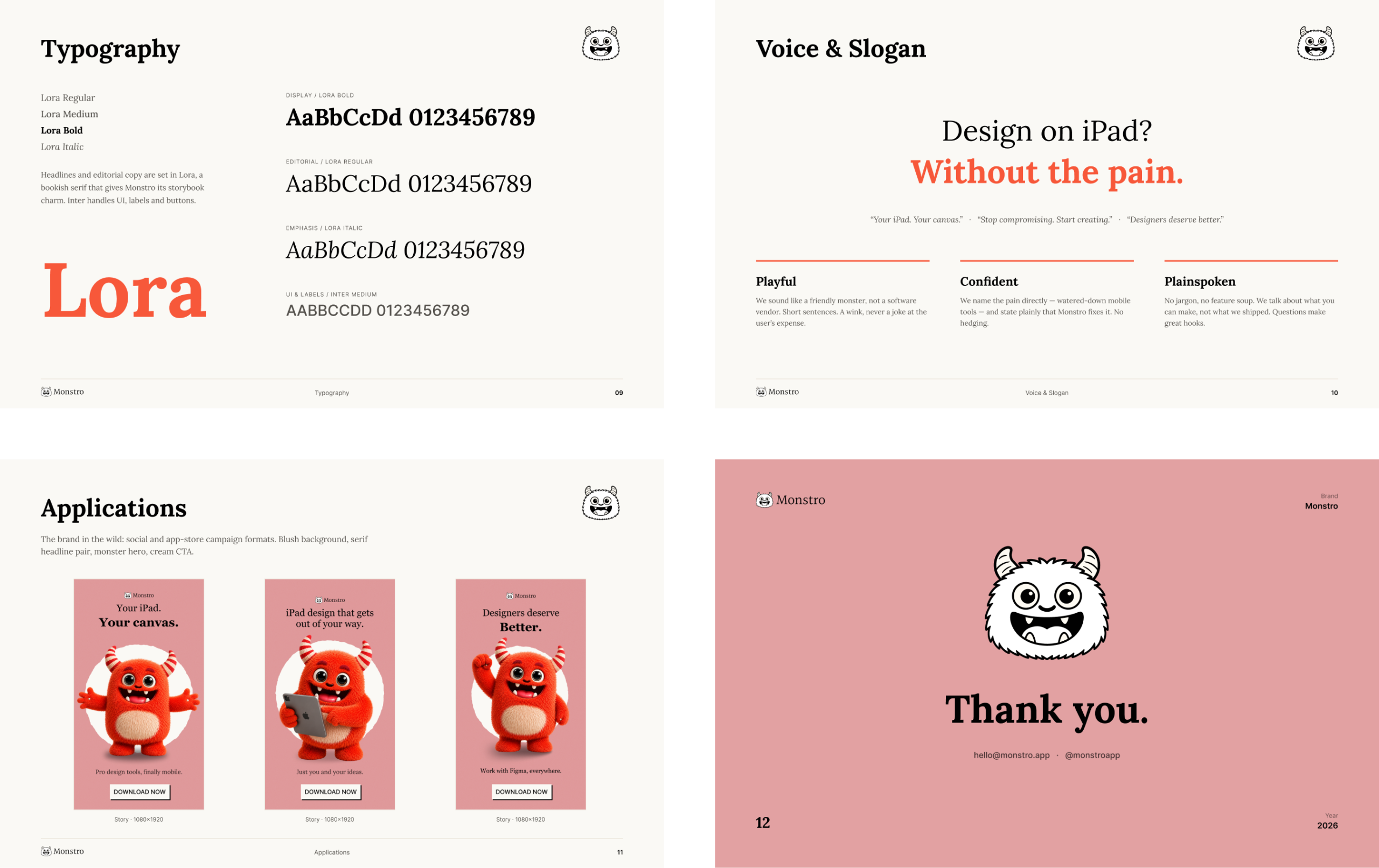
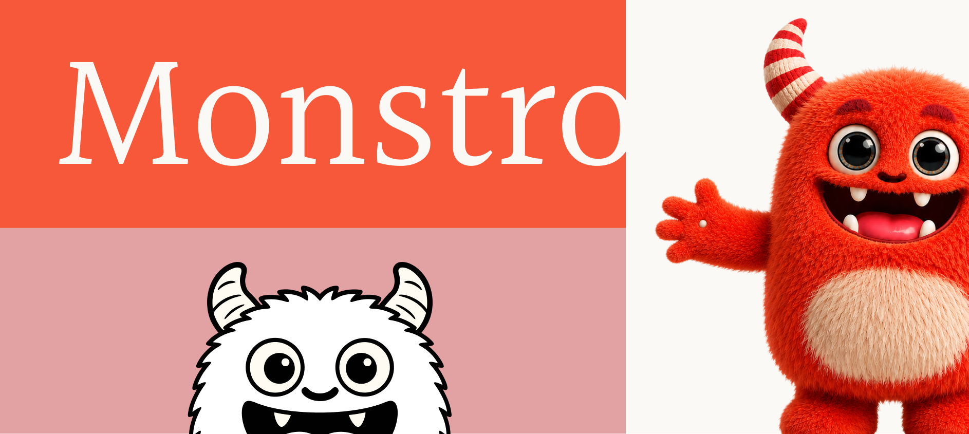
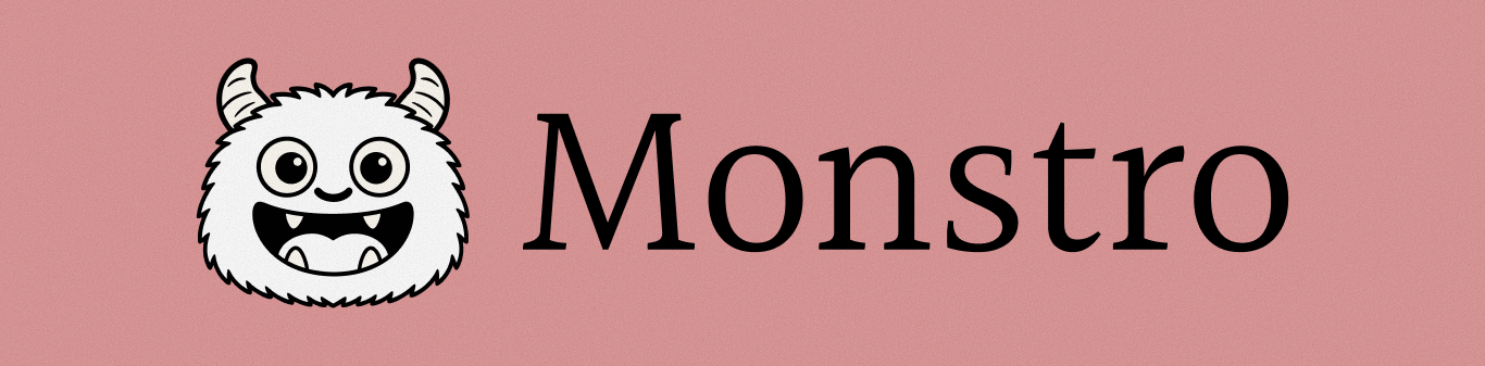
The wordmark uses Lora, a bookish serif typeface that gives the brand warmth and a subtle storybook quality. It creates an unexpected contrast with the digital precision of the product and makes the identity feel more human.
Inter supports the functional side of the system across interface labels, buttons and supporting information. Together, the two typefaces establish a clear relationship between Monstro’s expressive personality and its professional purpose.
The colour palette continues that balance. Monstro Red brings energy and emphasis, while Blush Pink and Cream soften the environment. Ink Black replaces harsh digital black, helping the entire system feel warmer and more tactile.
Bringing Monstro to life
Once the visual identity was established, I used generative AI to explore how Monstro could exist beyond the flat logo.
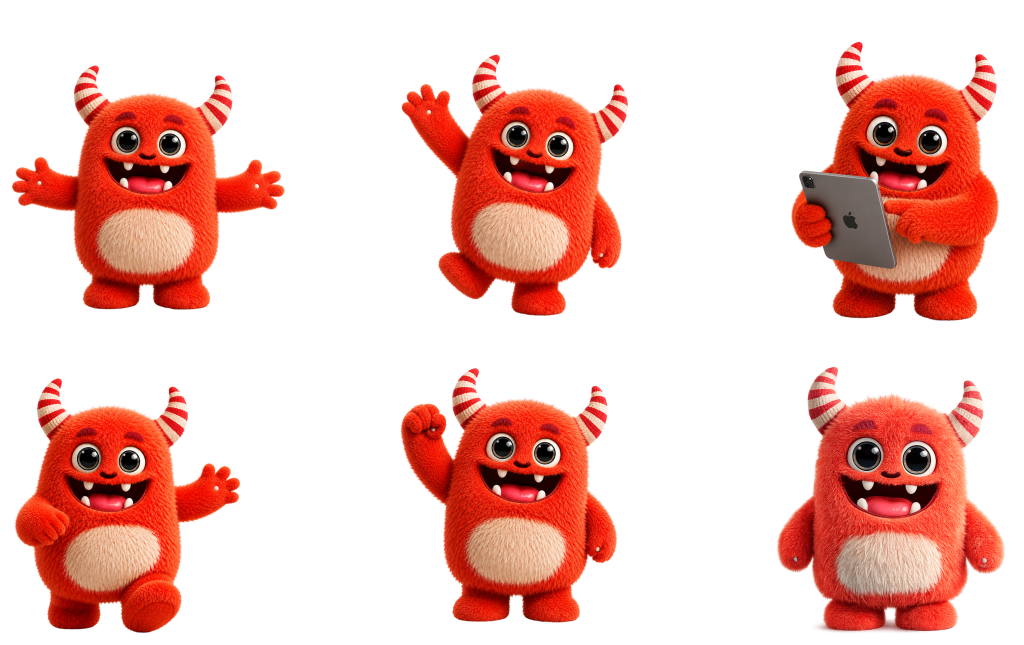
The original sketches and brand guidelines became the foundation for creating a three-dimensional version of the character. Through an iterative process of generating, refining and art-directing the results, I translated Monstro’s distinctive features—its striped horns, soft fur, expressive eyes and playful smile—into a consistent 3D form.
Generative AI made it possible to quickly explore different poses, expressions and scenarios while preserving the personality of the original character. I then used AI-assisted animation tools to turn selected frames into a short motion piece, testing how Monstro could move and behave as a living brand character.
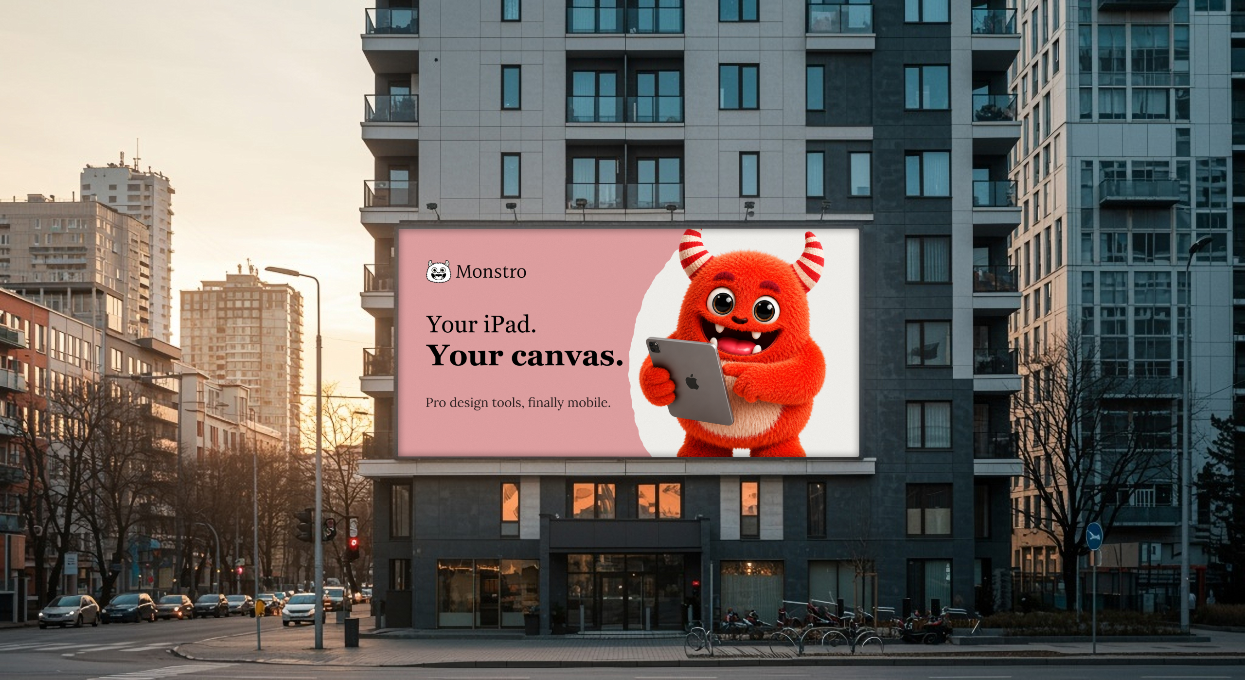
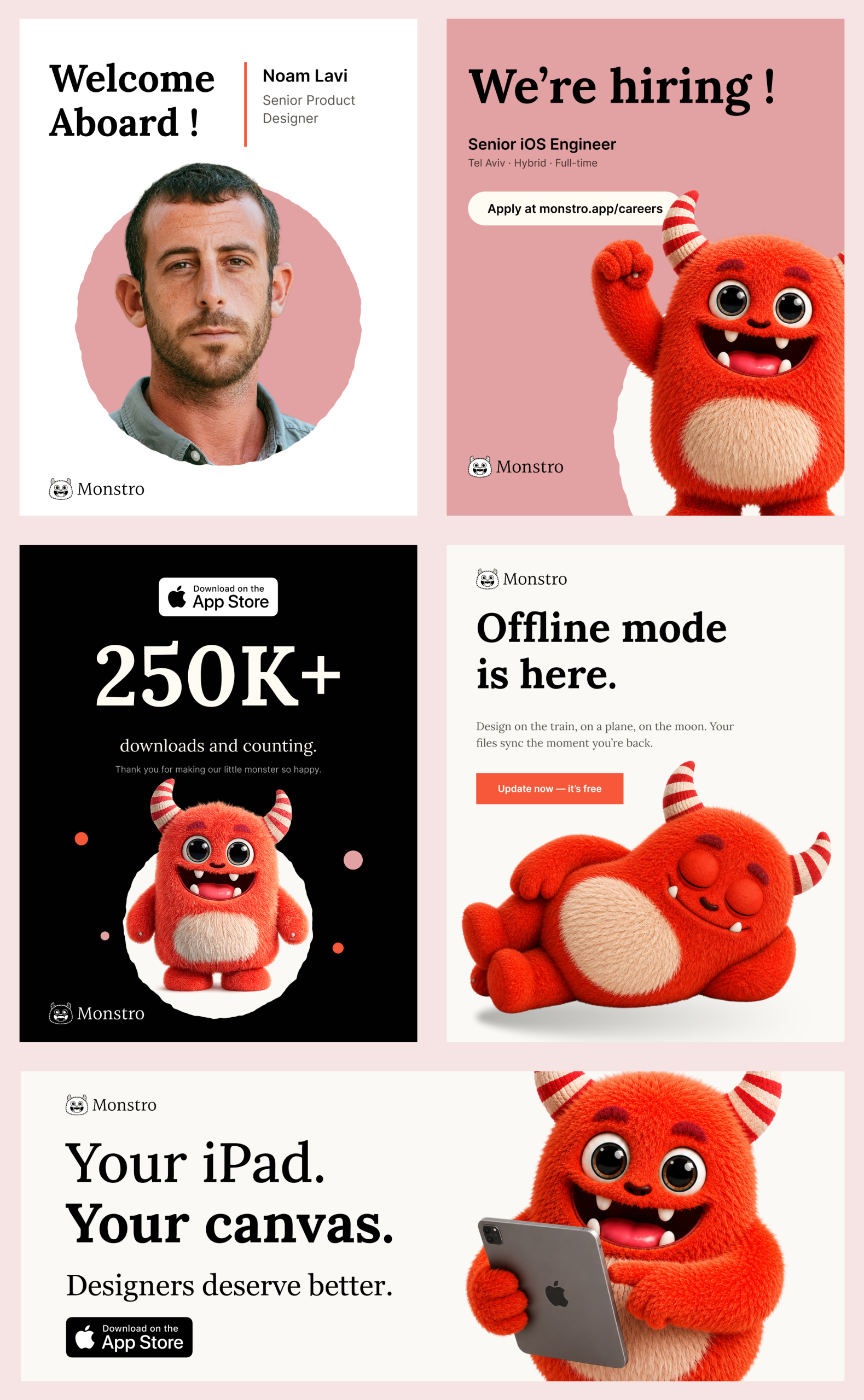
The result extended the identity into a more expressive visual world, ready for product launches, App Store campaigns, social content and motion.
From character to product
The identity was designed to behave as part of the product rather than as decoration around it.
Monstro can welcome designers into the application, introduce features, guide them through unfamiliar actions and add personality to empty states or moments of success. Its simple construction allows it to move naturally between product UI, the App Store and campaign materials without losing recognition.
Short, direct messages reinforce the product promise:
Design on iPad? Without the pain.
Your iPad. Your canvas.
Stop compromising. Start creating.
The outcome
Monstro transforms a complex professional tool into a brand with an immediate emotional connection.
What began as a collection of imperfect creatures became a flexible identity system—one that communicates precision, creativity and confidence without taking itself too seriously.
A little monster, built for serious design work.