
Background
Before the update, the app only displayed a basic price chart showing the stock’s movement based on a user-selected timeframe. The chart appeared on the stock page alongside the price quote.
The goal was to introduce advanced chart capabilities to improve engagement-related KPIs across stock pages in the app.
My Role
As Design Team Lead, I led the UX strategy in close collaboration with the Product Manager.
I owned the end-to-end process — from research and pain point definition to solution strategy and execution.
Additionally, beyond leading the design team, I also serve as the lead app designer at the company, so I was responsible for the UI design of this feature as well.
Our Objective
Our goal was to increase engagement-driven KPIs.
We hypothesized that improving engagement would drive higher long-term retention and ultimately increase conversion, as active users convert at significantly higher rates.
We defined success through the following metrics:
~1K
Monthly Active Users
Current State: Price-Check Behavior
5.3s
Avg. Session
Duration
~12%
30D
Retention
~12%
Chart Interaction
Rate
~18%
Repet to Page
(7D)
Target: Transform Stock Page into Engagement Drivers (60D Post Launch)
15s
Avg. Session
Duration
x2.8
18%
30D
Retention
+50% (+6pp)
25%
Chart Interaction
Rate
x2.1
30%
Repet to Page
(7D)
+67%
Retention growth is expected as a downstream effect of increased repeat engagement.
Research & Market Validation
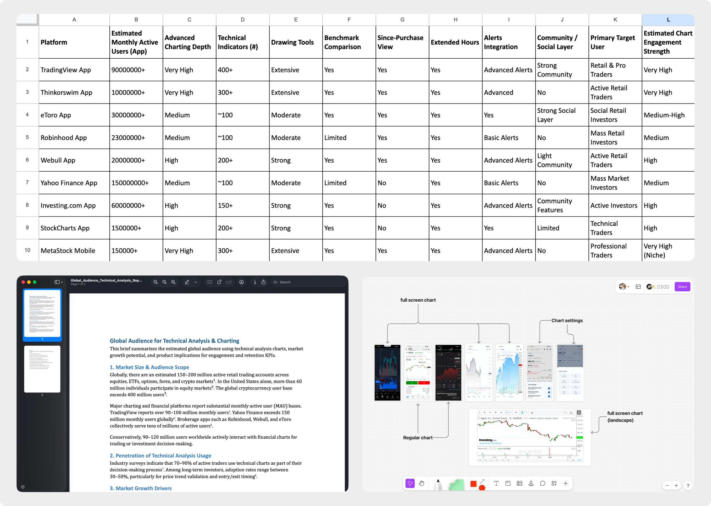
We conducted a focused research phase that included a competitive analysis of chart usability across leading financial apps, with particular attention to the integration of technical analysis tools.
We compiled a structured mood board featuring competitor chart screenshots to evaluate how technical indicators were implemented, how they affected usability, and how advanced the overall experience felt.
In parallel, we assessed the audience potential and business impact of introducing technical analysis capabilities — analyzing market size, user demand, and the potential contribution to key engagement and conversion KPIs.
Key Assumptions
Stock pages were used mainly for quick price checks, limiting engagement depth.
Adding advanced chart capabilities would increase interaction and session duration.
Personal context would drive stronger repeat behavior.
Benchmark comparison would improve perceived insight and analytical value.
Higher interaction would lead to improved repeat visits and downstream retention.
A more sophisticated chart experience would elevate product value perception.
Working Process
Insight Analysis
After analyzing competitors, reviewing relevant industry literature, and leveraging internal expertise from team members with hands-on trading experience in broker apps, we defined several features that we believe would help improve our KPIs.
These decisions were guided by our key assumptions — that increasing analytical depth, personalization, and contextual comparison would drive higher interaction rates, strengthen repeat behavior, and ultimately contribute to improved retention.
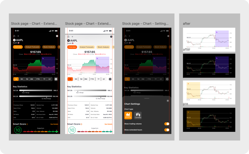
Showing holding P&L
(if the stock is part of the user’s portfolio)
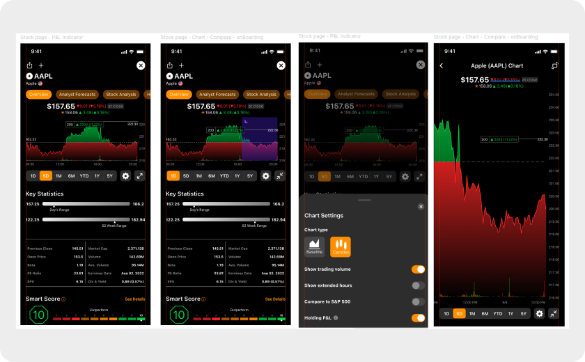
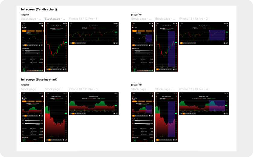
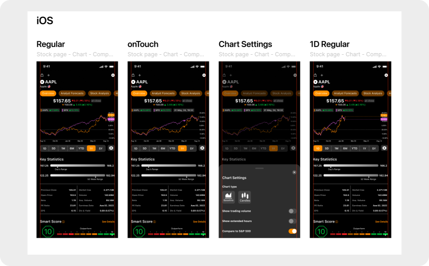
Introducing a full-screen chart view
Adding an additional chart type
(candlestick view)
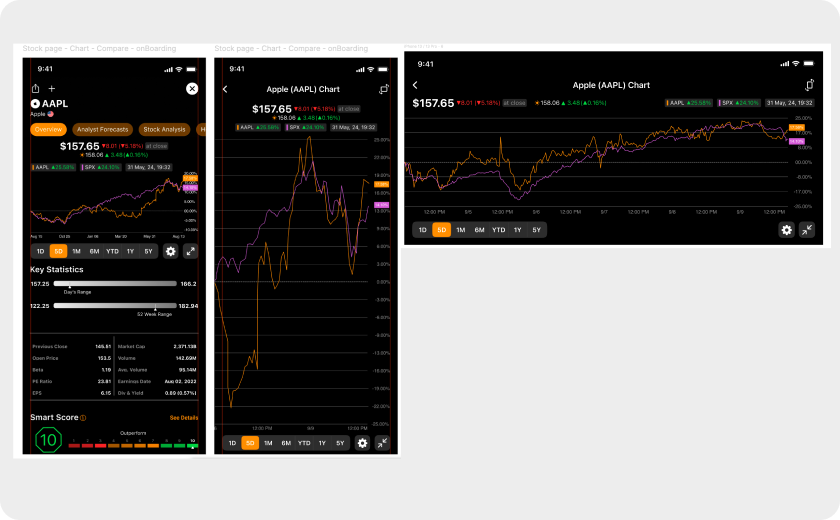
Displaying extended hours
(pre- and post-market trading hours)
Enabling relevant index comparison
(for now only S&P 500)
Moving into Design
At this stage, we had gathered sufficient insights to move forward. We broke the feature down into clear sub-features and defined the corresponding UX flows, interaction patterns, and design tasks.
With the scope well-defined, I moved into the design phase in Figma, translating both the UX strategy and product requirements into clear, intuitive UI solutions.
Rollout
We decided to roll out the feature to 100% of users from day one.
To measure usability and interaction:we implemented click-event tracking on the full-screen button and the chart settings button.
In parallel, we monitored ongoing analytics, including time on page and user-level tracking via unique user IDs, allowing us to measure retention and engagement on a per-user basis.
Feature Awareness Strategy
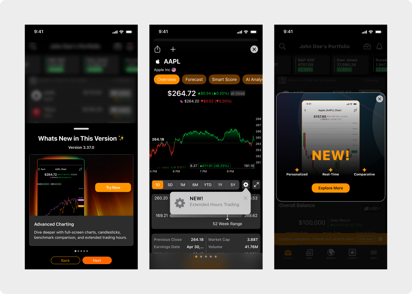
Since the feature is surfaced through two relatively small buttons — yet critical to achieving our KPI goals — we designed a lightweight but effective awareness strategy.
- Contextual Tooltip (iOS TipKit): We implemented a one-time tooltip per user, triggered directly on the relevant buttons. The goal was to drive discovery without creating friction or increasing bounce rates.
- In-App Message: A dedicated in-app message was displayed once after app launch, highlighting the new functionality and guiding users to explore it.
- “What’s New” Version Modal (In-App): We leveraged our in-app “What’s New” feature, shown to users after installing or updating the app, to highlight the new chart capabilities.
This multi-layered approach ensured visibility while maintaining a clean, non-intrusive user experience.
Results
Within 60 days of launch, the advanced chart feature generated measurable improvements across core engagement metrics.
~12s
(+~180%)
Avg. Session Duration
~22%
(+~98%)
Chart Interaction Rate
~30%
(+~63%)
Repeat to Page (7D)
~17%
( +4–5pp (+~45%))
30D Retention
Average session duration increased from ~5.3 seconds to ~12 seconds (+170–180%), indicating a meaningful shift from quick price checks toward deeper on-page interaction. Chart interaction rate grew from ~12% to 22% (+80–110%), suggesting solid feature adoption, though slightly below the most optimistic projections.
Repeat visits within 7 days increased from ~18% to 27–30% (+50–65%), reflecting stronger short-term habit formation and improved page-level stickiness.
30-day retention improved from ~12% to 16–17% (+4–5pp / ~+35–45% relative growth). While the retention lift was more moderate than engagement gains — and did not fully reach the upper-end target of ~18% — the directional improvement supports the hypothesis that sustained engagement growth can gradually translate into longer-term retention impact.
Overall, the data indicates that the feature successfully deepened engagement and improved repeat behavior, with early but still maturing effects on downstream retention.
Next Steps
The advanced chart feature has demonstrated strong impact across engagement metrics, validating the investment and confirming clear user demand.
User behavior indicates growing interest in deeper technical capabilities, particularly advanced indicators and expanded analytical tools. Based on this signal, we are currently evaluating the next layer of technical enhancements.
Given the technical complexity and extended development cycles associated with chart infrastructure, future additions are being carefully prioritized to ensure meaningful impact and efficient resource allocation.